Making conversion easy for everyone

UX/UI • CONVERSION • INTERNAL SYSTEMS • STAKEHOLDER MANAGEMENT

Sales had a superpower: on a call with a parent, they could bypass the usual study plan consultation and book a student directly into a lesson. This boosted conversion rates by 10%, and tutors loved it — instant, guaranteed work.
But on our newly rebuilt platform, that workflow was missing.
Context
MyTutor was migrating to a new tech stack with a clear goal: reduce risk by rebuilding the platform with feature parity. But conversion rates had dipped on the new site, so any functionality that could improve them quickly became a top priority.
Role
I led research and design and worked closely with a Senior Product Manager, Engineers and the Sales & Tutors teams.
Impact
Although the full feature wasn’t released due to a company acquisition and shifting priorities, the improved tutor experience led to a 23% increase in speed to match.
The problem
There were 3 sides to this story;
Parents - “I don’t need to meet loads of tutors, I want to get my child tutoring straight away”
Sales team - “I get more commission if I book a parent straight to lesson, let me do it!”
Tutors - “If I’m not meeting the parent before the lesson then I need to know as much information as possible beforehand”
Although the company aimed to reduce risk by rebuilding for feature parity, we were working with entirely new systems, both a redesigned platform and a new internal tool. This meant we had to fully understand the existing flow to ensure we could match or improve its impact on conversion, while also making it easy for tutors to accept this new type of work.
The approach
I started by observing several Sales calls to understand how and when reps successfully sold parents straight to a lesson, and what made those conversations effective. From there, I mapped the end-to-end journey for Sales, parents and tutors, identifying friction points, inefficiencies, and potential blockers to conversion.
Through ongoing feedback from key stakeholders, I iterated on the journey map to ensure it worked seamlessly within the new platform, while resolving the issues we’d uncovered.
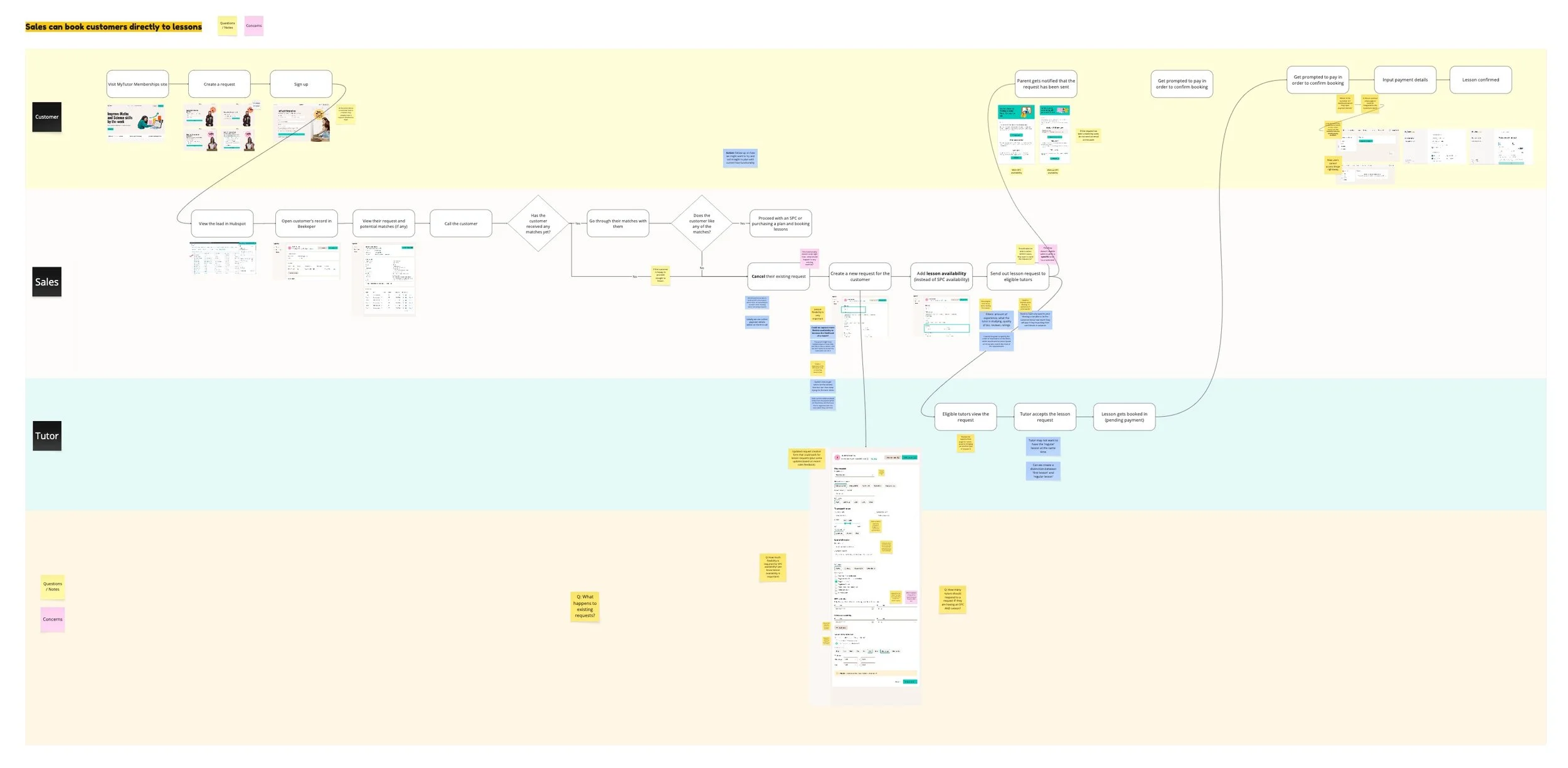
Early iteration of the journey map
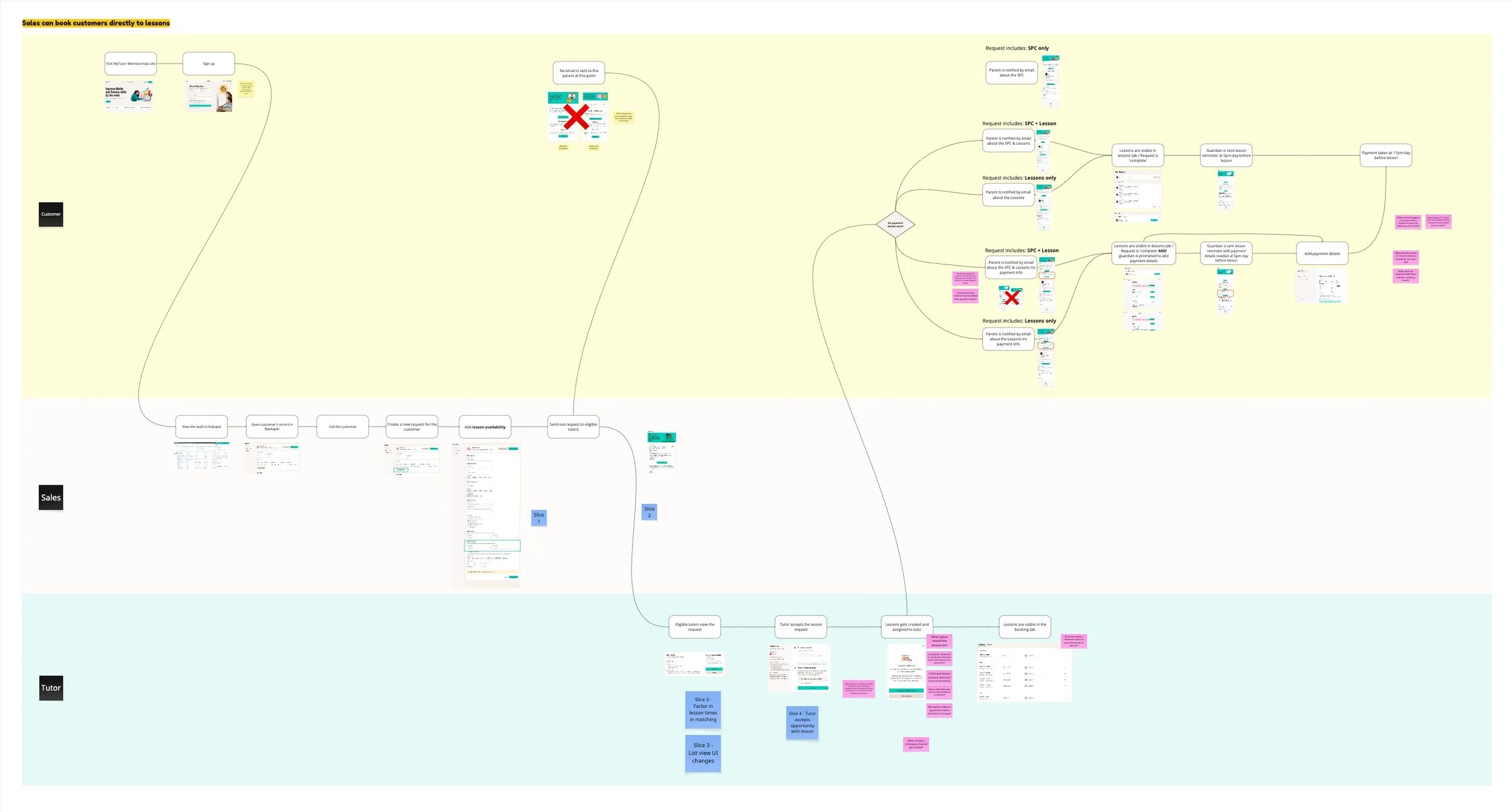
Final iteration of the journey map
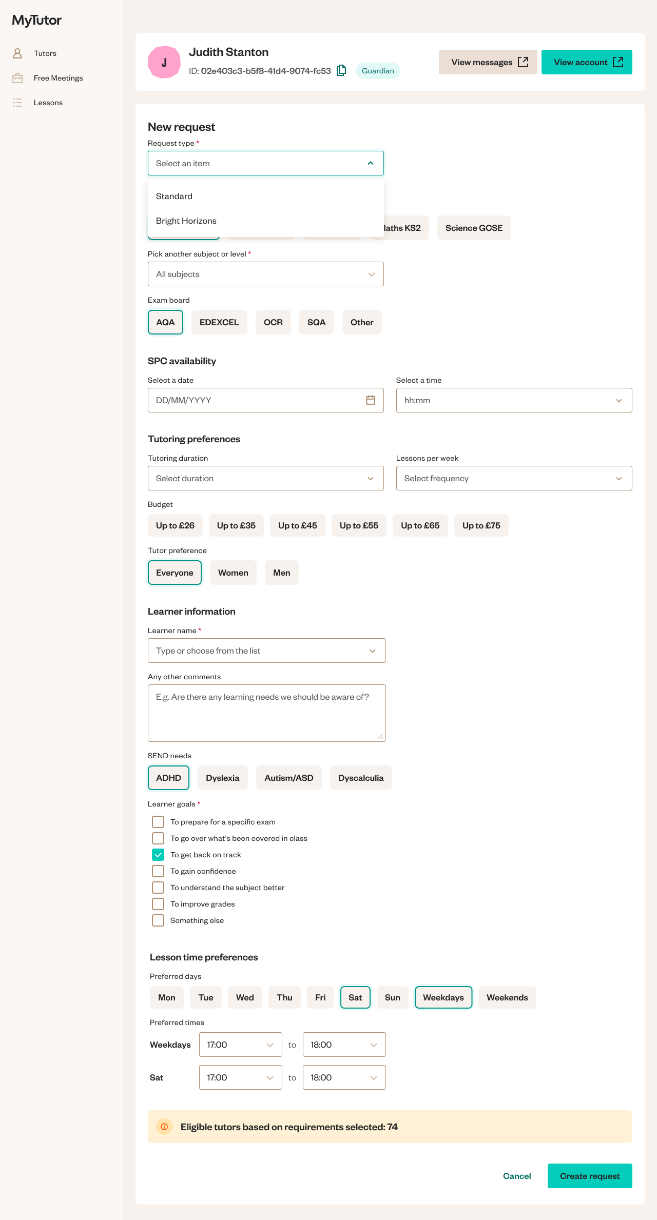
Sales already used a form while on calls, so I took this as a starting point and worked closely with them throughout. I added the relevant fields for lesson details and refined the language and layout to reflect how sales actually spoke and worked.
Existing form

New form
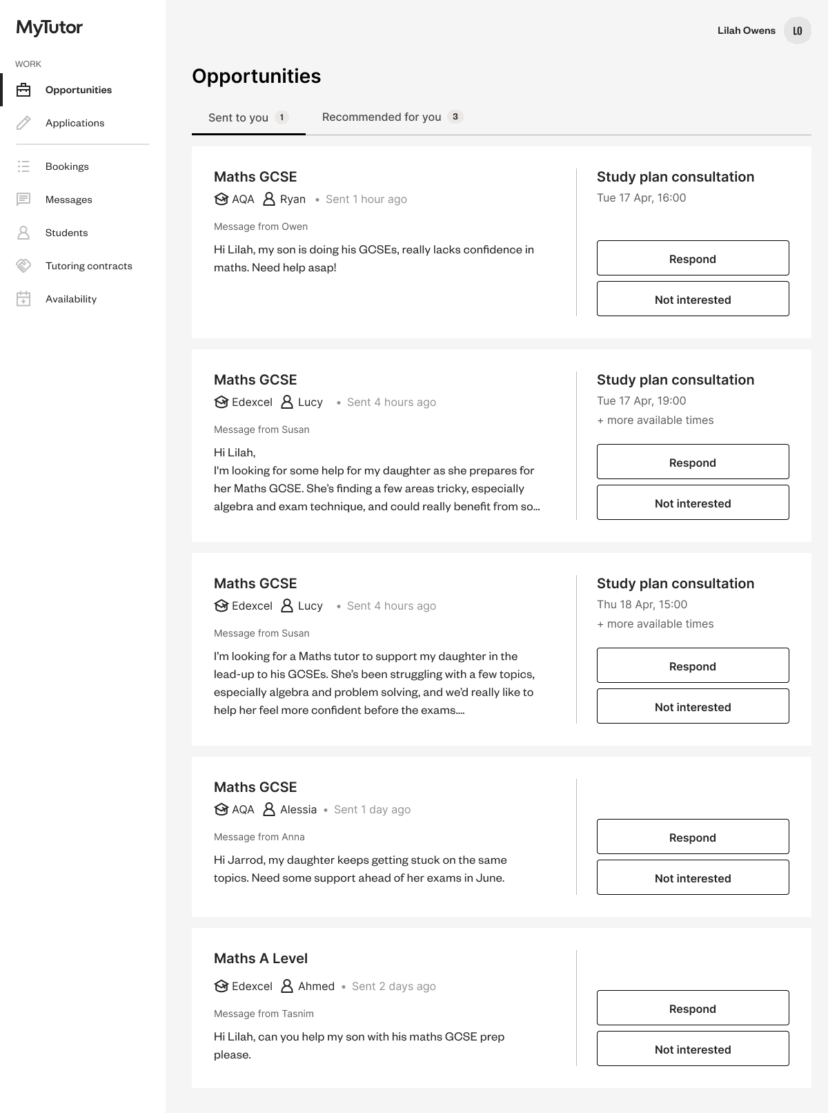
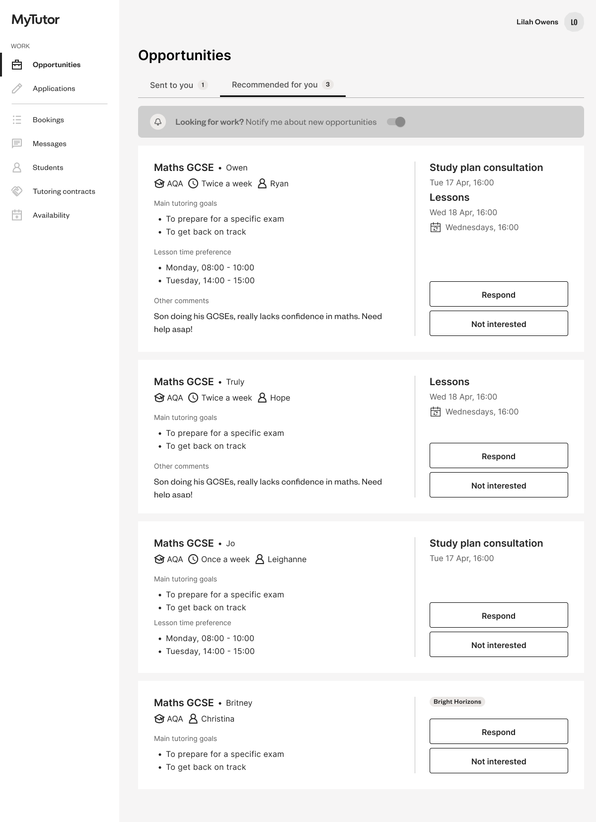
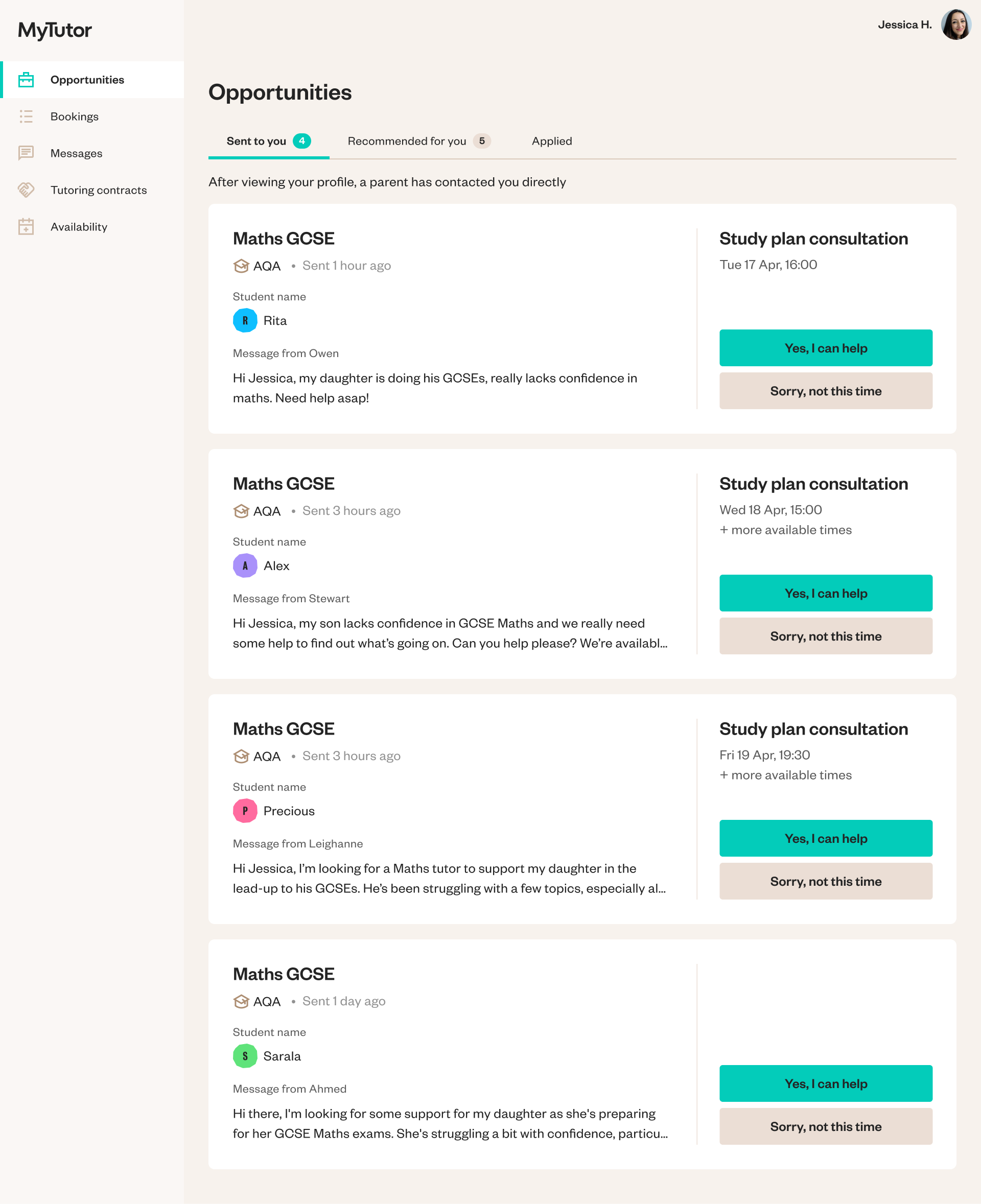
Tutors accept or decline work through their ‘Opportunities’ page on the new platform, while on the existing one, they accept work in several different places eg. messages, a jobs board, in lessons. This project introduced two new types of request to the new platform, ‘Lesson booking’ and ‘Study plan consultation + Lesson booking’, so we used it as a chance to explore how tutors were experiencing picking up work on the new platform more broadly. I ran interviews with four tutors to understand their needs and share early concepts. We learned that:
Tutors expected the new platform to behave like the existing one. When things worked differently or used unfamiliar terms, it caused confusion, especially since they were using both platforms in parallel and relied on prior knowledge to navigate.
Tutors also wanted more transparency. If a parent had already matched with someone else, they wanted to know so they could focus their time more effectively.
‘Sent to you’ (messages sent directly to the tutor from a parent’ vs. ‘Recommended for you’ (sales matched opportunities) made sense in theory, but the information hierarchy was reversed, the supposedly less valuable “Recommended” jobs had more useful details.
Early concepts shared with tutors during the research sessions
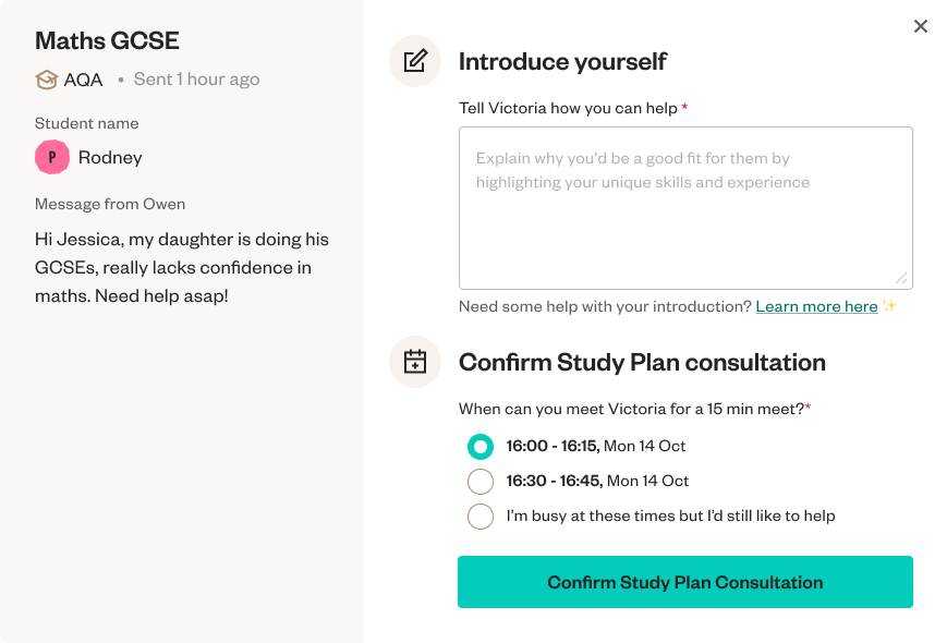
Using these insights and feedback from key stakeholders, I refined the concept designs by:
Replacing ambiguous language to reduce confusion
Aligning key features with the old platform where it improved familiarity
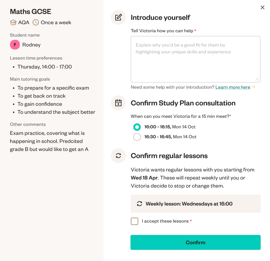
Designing a clear, step-by-step modal so tutors always understood what they were agreeing to
I then shared the updated designs with teams across Product, Sales, and Ops, gaining alignment and buy-in to launch the new experience.

The Impact
The redesigned tutor experience led to a 23% faster match time between tutors and opportunities, helping us keep momentum as we scaled the new platform.
But just as we were lining up the final pieces for Sales to book directly to lessons, the company was acquired and priorities shifted. The feature was paused.
While it was disappointing not to see the entire flow launched, we had built a strong foundation. And for me, this project was a great reminder that clarity, trust, and small friction points (in internal tools especially) can have a huge impact on outcomes.
The learnings
Throughout this work, I was repeatedly reminded how crucial clarity is. Internal teams often shared frustrations about processes that felt unintuitive or obstructive. Tutors, too, spoke about how confusing it can be when things change without explanation. Whether it was reordering a form to match how a Sales rep naturally speaks on a call, or adjusting language so tutors could better understand an opportunity — clear, intuitive design helped people do their jobs more easily.